Table of Contents
Copilot for Microsoft 365 in Excel is designed to enhance productivity by assisting with data analysis, comprehension, and visualization. Here are some of the ways it can help:
-
Analyze and Visualize Data: Copilot can help you explore and understand your data better by generating insights, charts, and pivot tables.
-
Generate Formulas: It can suggest formula columns for complex calculations, making processing and analyzing data easier.
-
Highlight and Sort Data: Copilot allows you to effortlessly highlight, filter, and sort your data to focus on what matters.
-
Create Charts: You can ask Copilot to create a bar graph or charts to show data trends and comparisons.
-
Efficient Data Management: Copilot can quickly turn a range of cells into an Excel table, essential for organizing and managing data.
These features aim to make data handling in Excel more efficient, allowing users to focus on deriving meaningful insights from their data.
Identify insights with Copilot in Excel
Copilot for Microsoft 365 can show insights based on your data or a specific question you ask about your data.
-
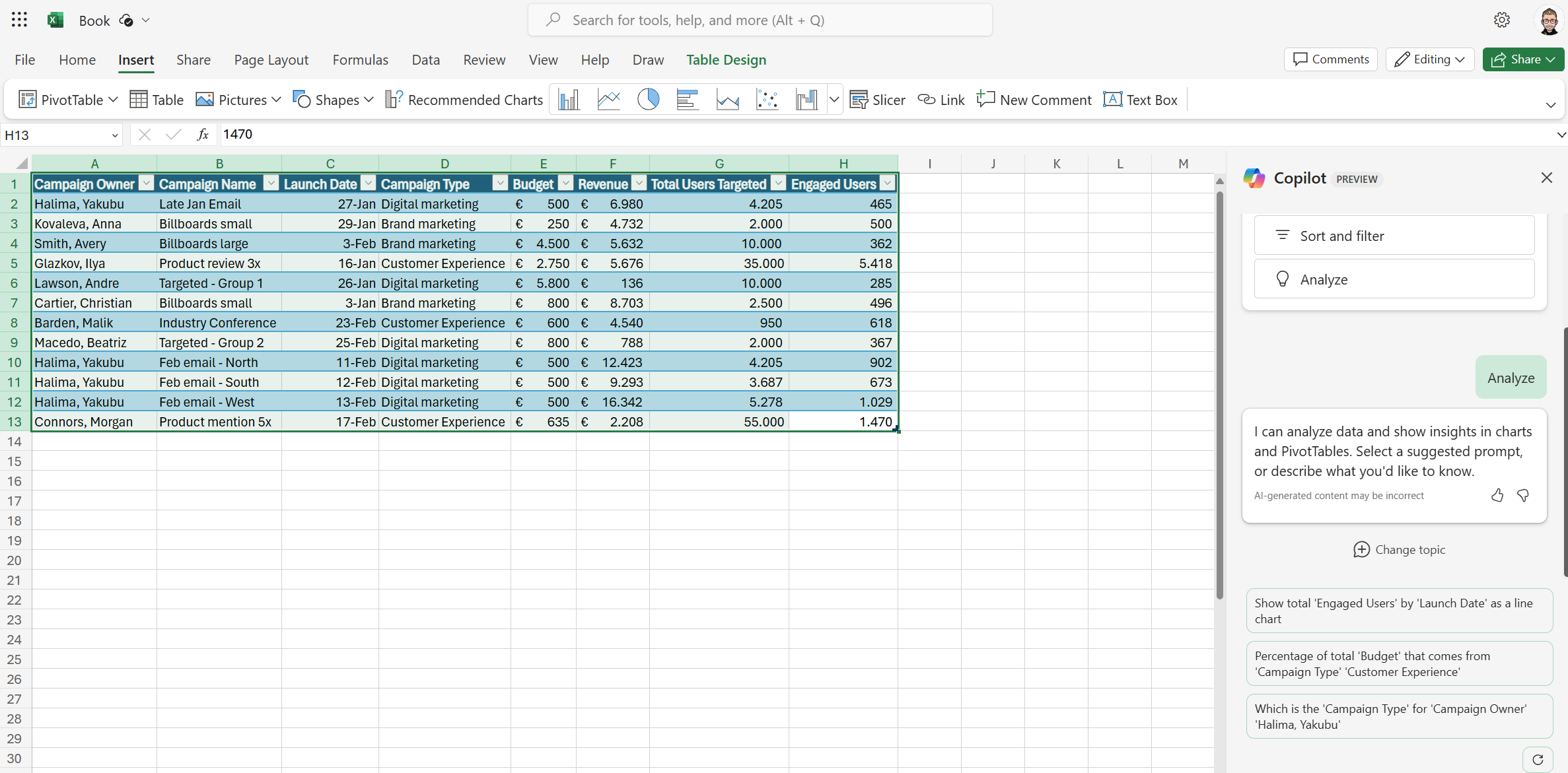
Format the data in your spreadsheet as a table, then select it.
-
Select the Copilot button in the ribbon.
-
Select Get Started.
-
Select Analyze and choose a suggested prompt. You can also describe what you’d like to know by asking a question about your data in your own words.

-
Select Send. Copilot analyzes your data to show insights as charts, PivotTable objects, summaries, trends, or outliers.
-
Use the refresh button to discover more prompts.
-
After Copilot has analyzed your data, review many different insights to find ones that help you make the most of your data.
-
Select Add to sheet to add a chart to the sheet. If multiple insights are available, you can add all insights to a grid in a new sheet. To undo this, select Undo.
Example:
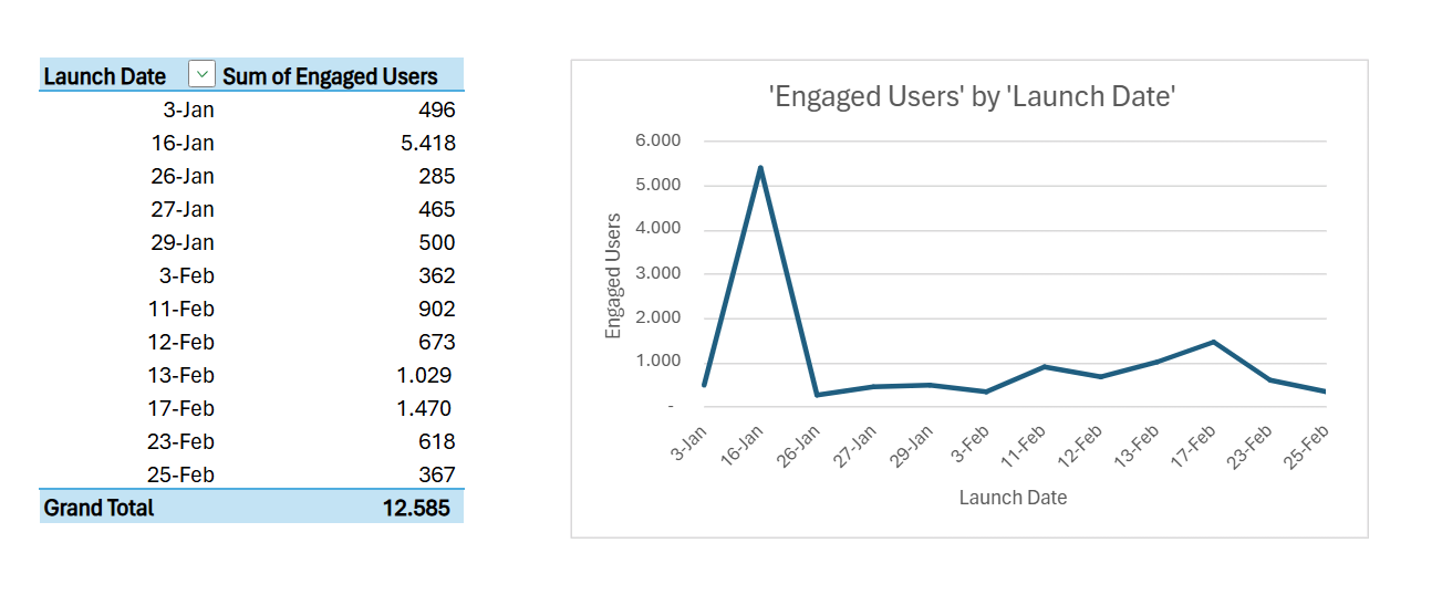
Show total ‘Engaged Users’ by ‘Launch Date’ as a line chart

Highlight, sort, and filter your data with Copilot in Excel
Copilot for Microsoft 365 simplifies highlighting, sorting, and filtering your tables, allowing you to focus on important data swiftly.
With just one table, you can:
-
Sort and filter your data.
-
Implement straightforward conditional formatting.
To begin, convert your data into a table format and click the Copilot button on the ribbon.
Next, instruct Copilot on how you want to modify the table to enhance the visibility of specific data segments. You can use your phrasing or select from the provided prompts.
Example:
Show items with ‘Campaign Owner’ of ‘Halima, Yakubu’

Example:
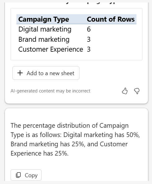
Percentage distribution of ‘Campaign Type’

Create formula columns using Copilot in Excel
Formula columns allow you to add new columns to your table that carry out calculations based on other columns in your data. For instance, you might create a formula column to compute each marketing campaign’s total cost per product or profit. With formula columns, there’s no need for manual calculation entry for each row. Instead, Copilot can swiftly insert new columns with formulas derived from your data.
-
Once your data is formatted as a table, click the Copilot button in the ribbon.
-
Choose either Add formula columns or Show suggestions for formula columns. Alternatively, you can specify the columns you want to add by typing in your own words.
-
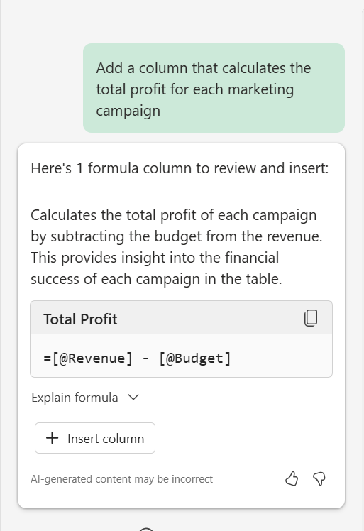
Copilot will offer formula suggestions along with explanations of how each formula operates. To view the explanation, click on Explain formula.
-
Click on Insert column to add the formula column to your table.
As with all AI-generated content, it’s crucial to review, edit, and confirm the accuracy of what Copilot generates.
Example:
Add a column that calculates the total profit for each marketing campaign


Conclusion
Copilot for Microsoft 365 in Excel revolutionizes how we manage and analyze data. By leveraging its capabilities to analyze and visualize data, generate formulas, highlight, sort, and filter data, and create insightful charts, it empowers users to streamline their workflow and focus on deriving meaningful insights from their data. Whether you’re looking to simplify complex calculations, enhance data visibility, or uncover key trends and outliers, Copilot is an indispensable tool in your data management toolkit. Remember, while Copilot significantly improves productivity, reviewing and verifying the AI-generated content for accuracy is essential, ensuring your data analysis remains precise and reliable.


Start the conversation